Form and Layout
Spacing
Using a consistent spacing system improves user experience and sets the foundation for responsive design and customizable UI density, leading to better quality and accessibility of our products.
Our spacing system is rooted in a 4-pixel base unit, which governs the spacing scale and guarantees a cohesive visual appearance across all products.
Token
Base unit multiplier
Pixels
Visual representation
spacing_00
0.5
2px
spacing_10
1
4px
spacing_20
2
8px
spacing_30
3
12px
spacing_40
4
16px
spacing_50
5
20px
spacing_60
6
24px
spacing_70
8
32px
spacing_80
10
40px
spacing_90
12
48px
spacing_10
14
56px
Corner Radius
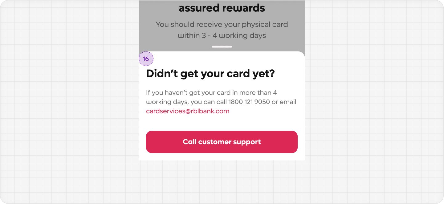
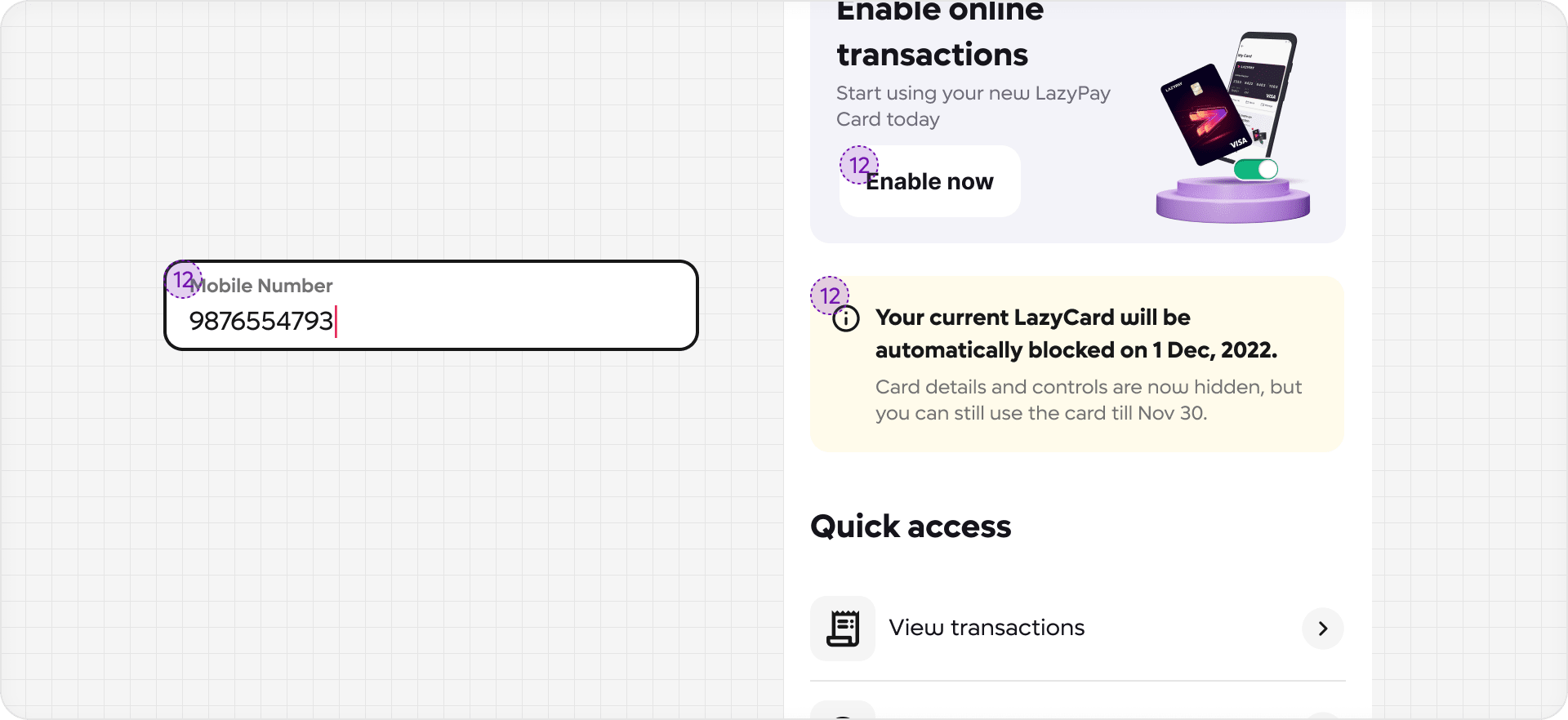
The metric values for corner radius are 16, 12, and 8. These radius metrics are dependent on the size of the component that it is applied to.
16 pixels
Used on large vessel-like containers, such as bottom sheets and modals

12 pixels
Used on smaller components, such as banners or input fields

8 pixels
Used on tiniest elements like icons or tags
