Buttons
Buttons serve as triggers for events or actions, informing users about the subsequent course of action.
Anatomy
The most basic configuration of a button includes only a single label or single icon, but a button can also be customized to include a label with leading icon and trailing Icon.

Usage
Hierarchy
A button hierarchy emphasizes which button is most important in the context so the user can take action right away.
Our buttons use color and contrast to create three levels of emphasis and hierarchy. The buttons with the strongest emphasis are primary buttons, followed by secondary, then tertiary.

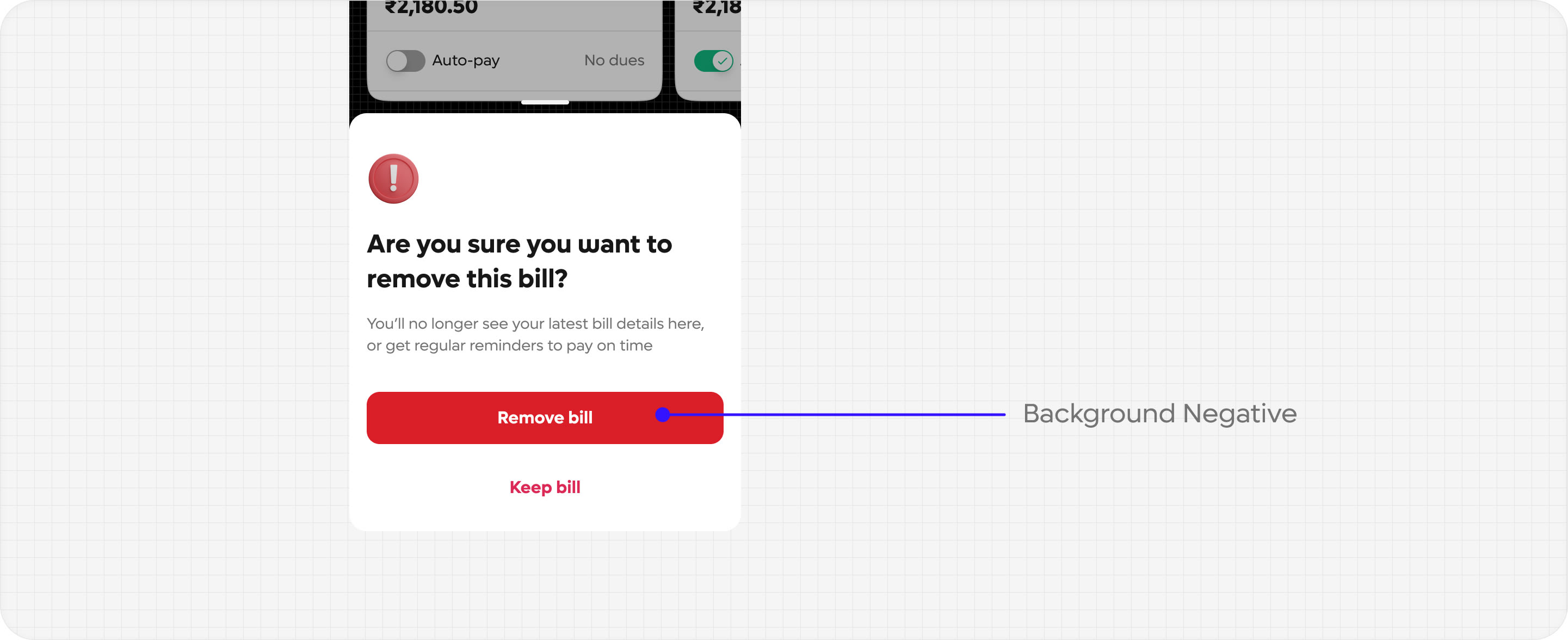
Destructive actions
Destructive actions refer to actions that result in permanent data loss. To prevent errors, it's crucial to establish a button hierarchy. Typically, there are two levels of destructive buttons that are often employed together: secondary destructive and primary destructive

Content
Keep it concise
Make your button labels easy to scan. Remove redundant language, don’t use articles and keep it as short as possible - the sweet spot being 2-3 words

Use sentence-case
Only the first letter of the label's sentence is capitalised, as well as any other specific noun that requires capitalisation

Be explicit
Communicate exactly what will happen when the user clicks.
Think about it like this: if you removed all the supporting text around your buttons, would the user still be able to complete the task? Button labels should make sense in isolation.
Some tips: Don’t use YES and NO in button labels.

Match the destination copy
Use the same language between your buttons and their destination to help meet the users' expectations.
Example: If the destination of a button is ‘Order placed’, the button label should be consistent with that language.
