Bottom Naviation
This mobile navigation pattern, widely recognized and extensively utilized since its early days, serves as a straightforward and prominent component, ensuring consistent navigation across the entire app
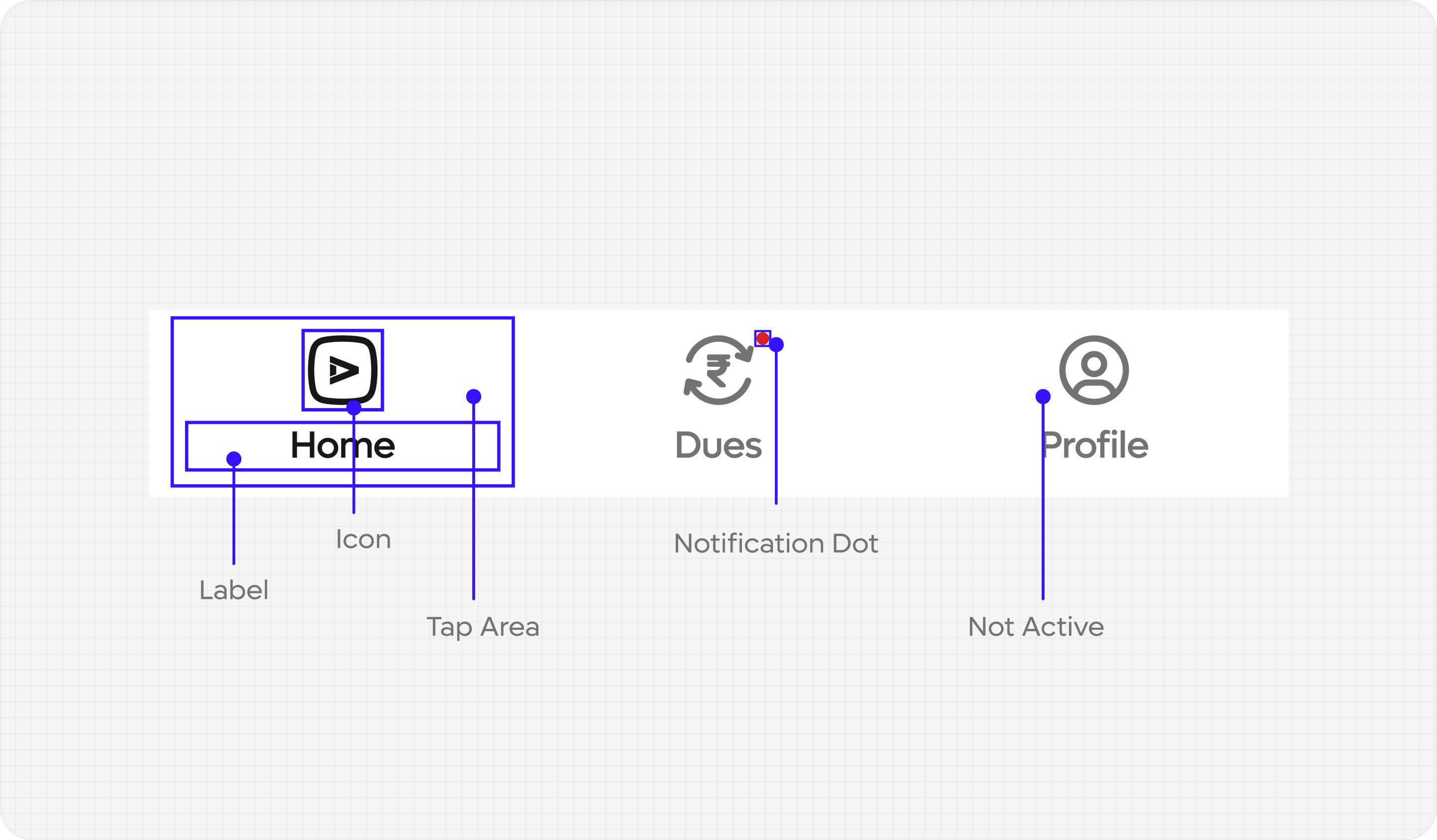
Anatomy
The bottom navigation supports a maximum of 5 tabs, with one tab active at a time. For enhanced functionality, you have the option to include a badge on one of the tabs. To learn more about its usage, please refer to the Usage section for detailed information.

Usage
The Bottom Navigation contains 3 to 5 equally sized tabs which are used to switch to different sections of your app.
Placement
The Bottom Navigation is affixed to the bottom of the screen, ensuring it remains visible and easily accessible. It remains fixed throughout the user's interaction within a section, enabling seamless tab switching at any given moment. The bottom navigation always remains in view, allowing users to transition between tabs effortlessly. The tab bar exclusively accommodates modals, prioritizing their prominence and drawing attention to their content.
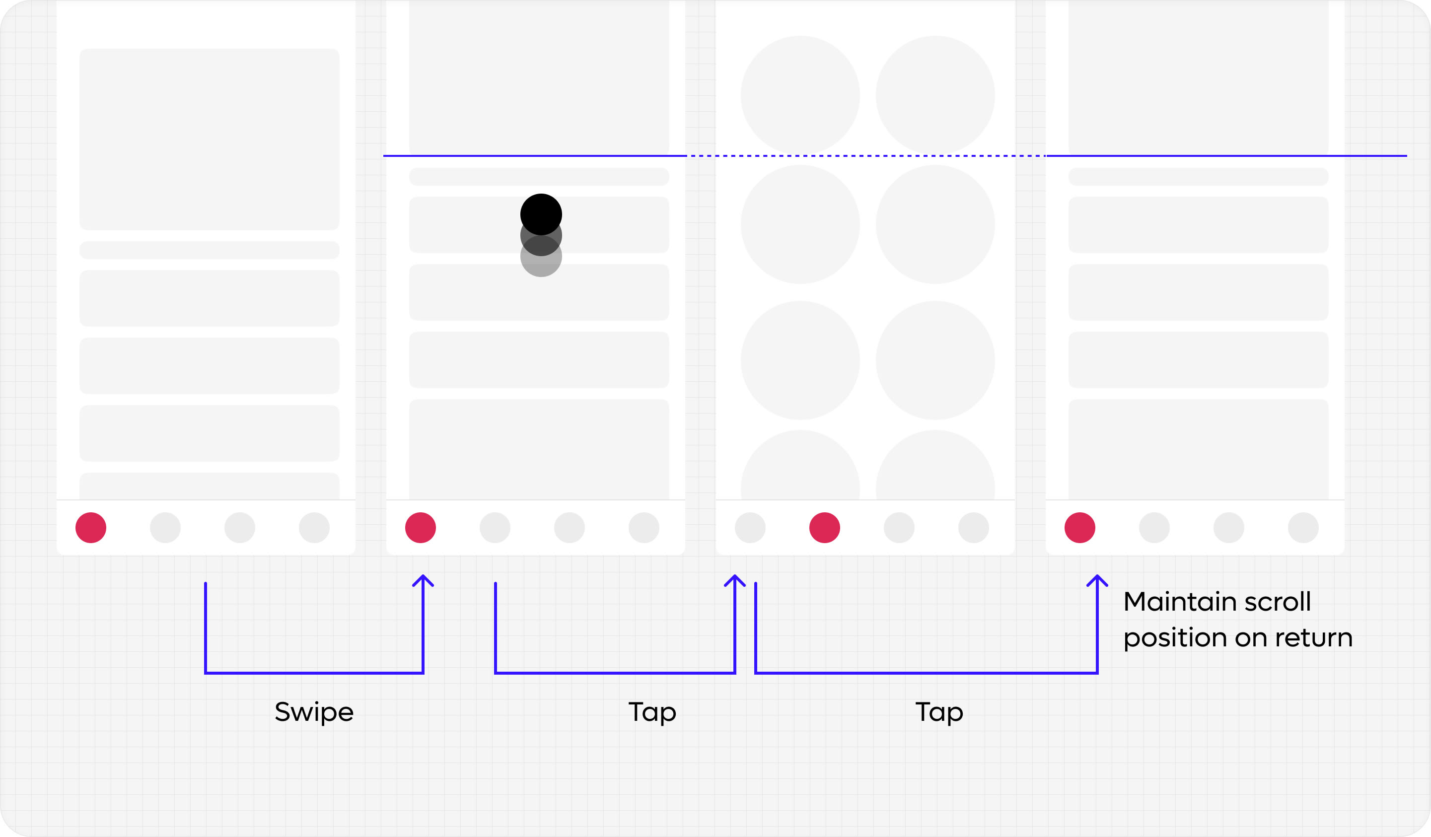
Behaviour
Every prior interaction on one of the sections should be maintained when switching to another.
